facebookpixel

Introducing the World’s Only Smart ECDN

analytics

Introducing the World’s Only Smart ECDN

Machine learning is revolutionizing modern business, improving efficiency while decreasing costs and increasing profits. According to a 2021 McKinsey survey , 56% of organizations today are using machine learning in at least one business function. In the same study, 27% of respondents attributed at least 5% of their earnings before interest and taxes (EBIT) to AI and machine learning.

At Kollective, we understand the power machine learning offers businesses, which is why we developed the world’s first and only Smart ECDN. In this article, we explore the specifics of our new intelligent solution and detail how simple managing your network has become.

What is Kollective’s Smart ECDN?

Kollective’s Smart ECDN was developed for one purpose – to radically simplify ECDN onboarding and management so that your network – consistently achieves peak performance. There’s not just one feature that makes this possible, but instead, a suite of intelligent solutions that work harmoniously to make the world’s first and only Smart ECDN. Five core features define Kollective’s Smart ECDN:

  1. Easy Activation
  2. Self-Service Network Topology Management
  3. Network Modeling
  4. Anomaly Detection
  5. Suggestive Analytics

Stress-Free Onboarding

Abstracting difficulty out of complex situations is a core function of a “smart” system. Kollective’s new onboarding wizard achieves this in spades, providing a fast and stress-free process for clients to configure their setup in five simple steps:

  1. Create an Account – Log in and authenticate with your Microsoft or G-Suite account.
  2. Configure Integrations – Select your integrations from an extensive list of the world’s leading front-end video applications and Kollective’s tool will walk you through how to quickly configure each to work with our ECDN.
  3. Define Network Configurations – While Kollective has terrific out-of-the-box settings that work well for most networks, our wizard allows users to customize their network settings quickly.
  4. Manage Privacy Settings – Enable custom privacy settings to control what data is collected.
  5. Invite Users & Complete Setup

Self-Service Network Topology Management

Whether your business is large or small, you understand that networks are complex. That is why Kollective has revolutionized how clients view and manage global network settings. Users can import all their network locations into our system to create self-service delivery parameters and unique network policies and behaviors for each.

With Kollective’s Smart ECDN, controlling your network has never been easier. Have offices in the DACH region that require different security settings than your offices in the Americas? Navigate to the “Network Locations” tab in the “Network Settings and Configuration” dashboard and create a unique policy for those locations.

Network Modeling

With any investment your business makes, it is crucial to understand the value you receive in return. That is why Kollective developed the Rapid Network Test (RNT) – to allow businesses to simulate how Kollective performs when networks experience a high volume of concurrent video streams.

While the RNT reveals if your network is ready to peer, Kollective’s Smart ECDN ensures that your network performs at its peak efficiency by running silent tests that construct a detailed model of your optimal network, providing the data it needs e to improve continuously. With Kollective’s Smart ECDN, you don’t need to be an IT expert to configure your network to stream flawless live videos. Model your network before running your first event and stream with confidence.

Smart Diagnostics

While Kollective’s network modeling optimizes your network before an event, our diagnostic dashboards provide ongoing support to identify and resolve issues as they arise. Our smart ECDN achieves this by using anomaly detection and machine learning to surface insights from past events to make future ones perform better.

Kollective’s solution delivers excellent results out-of-the-box, but we do not settle anything but the best. Our intelligent diagnostics stems from our broader philosophy to constantly refine and improve our processes to deliver the best product on the market. By detecting anomalies in your network through our diagnostics dashboard, Kollective’s Smart ECDN ensures that your network will be ready to meet the challenges as your business continues to evolve and grow.

What is Anomaly Detection?

One of the most powerful factors of Kollective’s smart diagnostics is its ability to recognize anomalies in your network. Our machine-learning protocols examine patterns of data playback that meet certain expectations. When something unexpected happens on your network, our anomaly detection algorithms recognize aberrant behavior based on indicators versus normal behavior and flag the event. These reports are the final pillar of our Smart ECDN, suggestive analytics.

Suggestive Analytics

When an event is flagged for aberrant behavior in Kollective’s smart diagnostics dashboard, our system analyzes the precise cause. It then alerts you to where the problem occurred in your network, what users were affected, and how to solve it so it does not happen again. Below are a few examples of problems that might occur and how quickly Kollective’s Smart ECDN will identify and solve them through the power of automation.

  1. Bitrate Thrash – One locality is having a poor event because too many bitrates were requested (e.g. 10). Kollective’s system would flag the event in the diagnostics dashboard, identifying that location with the recommendation that bitrate is pinned on that area of your network.
  2. Excessive Stalling – One locality is experiencing lengthy buffering during an event because peering nodes are stalling. Kollective would flag this event, and our suggestive analytics would recommend adjusting the performance settings in that location to “peering,” so more segments of a stream are built up before the video is peered to others on the node.

Experience the World’s Only Smart ECDN

Machine learning and AI adoption continue to climb as businesses steadily uncover their potential. Kollective’s Smart ECDN is our first step into this realm as we continue to seek new and innovative ways to create the best possible experience for our customers. Try Kollective today and experience the power of the only ECDN that constantly optimizes your network for peak performance.

The post Introducing the World’s Only Smart ECDN appeared first on Kollective Technology .

To view our Partner blog, click here

Performance Monitoring in Real Time

analytics

Performance Monitoring in Real Time

Real-time analytics allow businesses to quickly detect and address issues as they arise. It empowers your IT and network teams with faster decision-making capabilities and affords your business greater operational agility. In this article, we’ll show you how to monitor key performance metrics of your live events in real time using our advanced analytics platforms, Kollective IQ and Kollective Free Analytics .

This is our second article in a series of posts on real-time analytics. If you haven’t read the first article, explore How Real-Time Analytics Benefit Your Communications Strategy here .

Monitor Stream Quality in Real Time

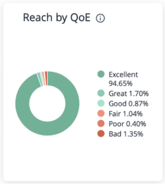
Kollective IQ and Kollective Free Analytics provide several ways to track the stream quality of your event in real time. In the analytics dashboards, stream quality is represented by QoE (Quality of Experience). Start with the “Reach by QoE” tile in the views and experience dashboard. The donut chart displays the percentage of viewers experiencing each level of QoE, from excellent to bad.

Reach by QoE

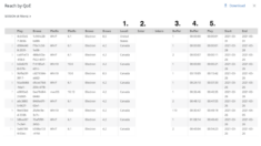
In the example above, we notice that 1.35% of our audience has experienced bad streaming quality at some point in this event. Rather than waiting for our event to end, we can explore this data while our event is still in progress. Simply click on the section of the Reach by QoE chart you want to examine to bring up detailed statistics broken down by user. Clicking on the “bad” section of the chart reveals new data fields to help you diagnose potential issues (see below).

Reach by QoE analytics

While there are many columns in this report, highlighted are five of the most useful:

  1. Locality – The viewer’s country
  2. External IP – The viewer’s external IP address
  3. Number of Buffering Events – The number of separate buffering instances the viewer experienced
  4. Total Buffering Time – The amount of time spent buffering during playback
  5. Total Playback Time – The amount of playback time without buffering

Reviewing the detailed statistics on “bad” QoE scores reveals a series of users experiencing varying degrees of buffering. Some users are experiencing lengthy buffering delays, while it appears others abandoned the stream early perhaps in response to buffering problems. Looking at the most severe cases, we notice that most of these users are located in Canada and share the same external IP address (note: IP addresses have been obscured for privacy purposes).

In a few quick steps, we’ve determined that employees at a Canadian office are having buffering problems. Armed with this information, we can contact IT at this office to resolve the issue while our event is still running. We can also send the event as video on demand (VOD) to all employees at that location as soon as the event ends to ensure essential messaging isn’t missed.

Identify Buffering by Location in Real Time

The delivery and consumption dashboard in Kollective IQ and Kollective Free Analytics provides another method for monitoring stream quality in real time. In the previous example, you learned how to analyze groups of viewers that experienced the same QoE and identify potential geographic trends. In this example, we’ll start with geography and show how to quickly and easily detect issues.

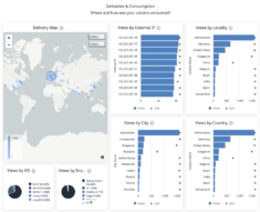
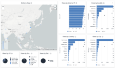
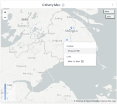
Before diving into the example, let’s review the delivery and consumption dashboard. The primary areas of concern for this dashboard are the delivery map on the left and the four bar graphs on the right. The map contains a series of circles that represent event viewership for a given location (larger circles equal areas of greater viewership). The bar graphs list the top ten areas of viewership broken down by: external IP, locality, country, and city. Each field on the bar graphs has a corresponding QoE dot that represents the average streaming quality for that location.

Delivery Map Free Analytics for Microsoft Teams

Starting with a high-level overview, we see that all countries listed in the top ten have good QoE scores except China. Notice in the Views by City graph that the Shanghai office is performing poorly. Click on the Shanghai bar graph to explore this data or zoom into the delivery map to select the Shanghai office, excluding any nearby remote viewers.

Delivery Map City Example - Free Analytics

Since these graphs provide a quick QoE reference for the ten locations with the highest event viewership, it’s often the fastest way to detect buffering and stream quality issues for events in which ten or less offices are participating. However, with events streaming to more than ten locations it’s best to use this dashboard in conjunction with the “Reach by QoE” tile discussed in the first example of this article.

Track Microsoft 365 Video Performance in Real Time

Are you using Microsoft Teams or Stream to deliver live and on-demand video? Gain real-time insights into event performance and employee behaviors with Kollective Free Analytics today.

The post Performance Monitoring in Real Time appeared first on Kollective Technology .
To view our Partner blog, click here

What’s New in Kollective IQ?

analytics

What’s New in Kollective IQ?

Kollective IQ, our advanced analytics platform, has new dashboards that will reveal some key performance indicators (KPIs) commonly used to assess event performance. The dashboards have been redesigned to help better understand the impact and quality of your events, engagement across the enterprise, and so much more!

Kollective IQ contains three primary dashboards:

  1. Views & Experience
  2. Delivery & Consumption
  3. Network Performance

Views & Experience Dashboard

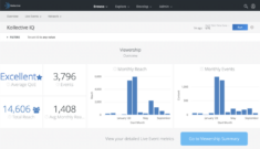
The views and experience dashboard displays the reach, stream quality, and engagement of an event. Top-level insights are easily digested through the six key performance indicators (KPIs) displayed in the dashboard. Users can drill down to explore data on specific users by interacting with the graphs. If you hover over a tile, there are options in the upper right corner that will allow you to download or explore the data, and even set an alert for metrics that could be of particular interest.

Kollective IQ Views and Experience Dashboard

Quality of Experience (QoE) Score is an aggregate rating, representing the overall stream quality for everyone that viewed an event. This score is a combination of two factors — the quality of video received (measured by bitrate) and the time to first frame.
Reach indicates how many unique viewers streamed an event.
Max Reach represents the greatest number of simultaneous viewers during an event.
Average View Duration measures the average amount of time viewers spent watching the event.
Reach by QoE is a pie-chart organizing viewers by the level of stream quality they experienced during an event. Scores are displayed on a graded scale, ranging from excellent to bad. Click on the pie-chart to explore specific segments in greater depth.
Event Reach Over Time reports the reach for every minute of the event. This indicates audience engagement, allowing one to easily identify changes in attendance over the course of an event. Monitor this graph while your event is running for engagement insights.

With the views and experience dashboard, your team will understand:

  • How many people attended an event
  • When attendees joined and left an event
  • How engaged employees were during an event
  • Any issues with buffering and stream quality

Delivery & Consumption Dashboard

With hybrid work becoming the new norm, it’s crucial that businesses understand where and how their content is streamed to ensure video communications are successfully delivered throughout the enterprise. This delivery and consumption dashboard does just that. The intuitive graphs and interactable map enable the rapid identification of locations that experienced buffering problems during an event.

Kollective IQ Delivery and Consumption Dashboard

Delivery Map shows everywhere your event was viewed. Larger circles indicate areas with greater viewership. Users can explore and interact with the map directly. Click on clusters to view detailed data for specific offices or locations.
Views by Location are a series of four separate bar graphs that are broken down into geographic segments (external IP, locality, country, and city). Each graph lists the top ten places with the most event views. These charts include QoE dots that represent stream quality for each location. See a region with poor stream quality? Click on the corresponding bar graph to explore the data in more detail, uncover potential trends, and develop a resolution plan.
Views by OS details which operating systems were used to stream an event.
Views by Browser displays which browsers were used to stream an event.

With the delivery and consumption dashboard, your team will understand:

  • Where an event was streamed
  • Which offices participated most in an event
  • Where issues with stream quality and buffering occurred
  • What browsers and operating systems were used

Network Performance Dashboard

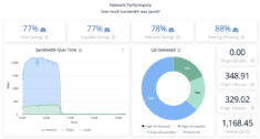
The network performance dashboard shows how much bandwidth was saved by using Kollective’s enterprise content delivery network (ECDN) to deliver the event. Kollective IQ’s dashboard offers a unique lens into network performance, allowing users to monitor an event’s impact on their network in real-time as an event runs and after it ends.

Kollective IQ Network Performance Dashboard

Total Savings is the total bandwidth savings for all viewers of an event, including those not capable of peering.
Capable Savings is the total bandwidth savings for all viewers of an event that were capable of peering.
Peerable Savings is the total bandwidth savings for all viewers that successfully peered an event (joined a cluster with other peers).
Peering Efficiency displays the percentage of bandwidth that was delivered through peering in relation to the size of each peering group.
Bandwidth Over Time shows the amount of bandwidth that’s consumed over the course of the event. This graph is an excellent indicator of the ECDN’s performance. The green portion of the graph represents the amount of bandwidth that was pulled from your network, while the blue portion displays the amount saved from peering.

With the network performance dashboard, your team will understand:

  • How much bandwidth Kollective’s ECDN saved your network
  • Bandwidth utilization over the course of an event
  • How well your event was peered

Kollective IQ – A Perfect Addition to Your Communication Platform

Adding an advanced analytics platform like Kollective IQ supercharges your broadcast event reporting, yielding actionable insights to help you understand employee experiences and maximize performance.

The post What’s New in Kollective IQ? appeared first on Kollective Technology .
To view our Partner blog, click here

Webinar Recap: What Great Analytics Reveal About Microsoft Teams Live Events

analytics

Microsoft Teams Live Events have become an indispensable tool for enterprise communications. From high production events like company-wide town halls to crisis communications requiring quick turnarounds, Teams Live Events can engage and connect distributed workforces. To ensure these communications are successful, Live Event reporting is crucial.

In a recent webinar, What Great Analytics Reveal About Microsoft Teams Live Events , Garrett Gladden, Director of Product Management at Kollective, outlined the importance of understanding Live Event reporting data, identifying key performance indicators (KPIs) for Live Events and how adding an advanced analytics platform provides those insights where and when you need them.

Let’s Talk Teams

Teams Live Events are an extension of Teams Meetings meant for one-to-many communications. With Live Events you can broadcast to up to 100,000 attendees no matter their location or device.

Garrett was joined by Raphael Barini, Microsoft Modern Workplace Technical Architect at the time of the recording, who ran a quick demo on creating and running a Teams Live Event.  In the demo he covered:

  • How to set-up a Live Event in Teams
  • A breakdown of the different options you have when creating your event
  • Best practices for inviting attendees
  • Starting and managing the event as a Producer

The ease and simplicity of Teams Live Events allows anyone in the organization to set-up an event to relay important messages efficiently and at scale.

Data Needs Meaning

Teams Live Events produce a large amount of data. To be of any value in running a successful event, that data needs meaning. Finding that meaning, Garrett explained, requires two things – recency and relevance. Recency requires accessing the data when you need it which, to be actionable, is during the event. To achieve relevance, that data needs to be surfaced where you need it, in a centralized and easy to use dashboard.

Meaningful (and Easy) KPIs

Teams Live Events provide Attendee Engagement reports you can download after the event but does not provide actionable data in a usable format while the event is in process. To access this data as well as additional insights into video performance and employee engagement in real-time Garrett recommended using an advanced analytics platform like Kollective IQ .

Using a Southeast Asia business strategy planning event as an example, Garrett detailed the metrics you can access from a Teams Live Event with Kollective IQ. The event was held during COVID-19 lockdowns with the majority of attendees joining the event from home. The high-level analytics pictured in the dashboard below show that the event was a success.

Teams Live Events metrics with Kollective IQ analytics

Quality of Experience (QoE) Score shows what the experience was for everybody receiving the event content. The score is a combination of two metrics – the bitrate or quality of the video they received and the time to first frame or how long they waited for the video to arrive.
Average View Duration measures whether viewers stayed for the duration of the broadcast or dropped off letting you know how much of the content was consumed.
Reach indicates the attendance rate for the event and is measured by unique viewers.
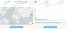
Bandwidth Savings is the amount of bandwidth saved by using Kollective’s Enterprise Content Delivery Network (ECDN) to deliver the live event.
Peering Efficiency is another indicator of the ECDN’s performance and in this example shows that high concentration regions were able to share content at the edge, pulling the Live Event from a peer rather than the network.
Geo Explorer shows where the content was consumed.

This data quickly answers the questions:

  • Did attendees have the experience that we wanted?
  • Did people watch for the duration showing that we effectively communicated with them?
  • Did we reach the number of people that we targeted?
  • Did we reduce strain on our network?
  • Did Kollective’s peering do the heavy lifting instead of our network?
  • Where and by whom was the content consumed?

For a deeper understanding of the data or specific users, Kollective IQ allows you to drill down into and explore each of these metrics.

Teams + Kollective IQ

Microsoft Teams lets you produce and distribute live events to your entire workforce no matter their location or device. Adding an advanced analytics platform to the mix lets you visualize your attendee experience and network performance and make real-time adjustments.

Kollective IQ offers you:

  • Persona-based workflows with stellar UX
  • Delivery of ALL data to clients, with data mining, exploration, and custom
  • calculations
  • Custom visualizations and dashboards
  • Data exportability with many formats to many destinations

Test out Kollective IQ’s valuable and actionable insights for Teams Live Events today.

The post Webinar Recap: What Great Analytics Reveal About Microsoft Teams Live Events appeared first on Kollective Technology .
To view our Partner blog, click here

Kollective IQ: The Smartest ECDN Analytics Platform Just Got Smarter

analytics

When it comes to enterprise content delivery network (ECDN) analytics, not all platforms are created equal. Some only surface high-level insights; others limit the data you have access to; many make it difficult to find the metrics that matter. Not Kollective IQ . We provide the deepest and most user-friendly insights into enterprise video streaming and software delivery on the market.

Let’s walk through a few of the reporting features that make Kollective IQ a cut above the rest.

Custom Dashboards, Reports & Visualizations

Screen Shot 2020 09 17 at 8.28.09 AM 1024x589 1

Kollective IQ is designed with intuitive, out-of-the-box user workflows that make it easy for you to find the information that is most important to your role, whether you’re a communications professional, SCCM manager, network administrator or event producer. But the insights don’t stop there – Kollective IQ makes it simple to create custom dashboards, reports and visualizations.

  • Need to report on content deliveries in Hong Kong to your CTO?
  • Does your CEO like to know the metrics tied to their latest All Hands broadcast?
  • Is it imperative you receive immediate insight into security patch deployments?

Kollective IQ makes all your reporting needs possible – you can even deliver locality-specific analytics.

Locality-Specific Analytics

First things first: let’s define what a locality is and why it matters in the context of ECDN analytics.

The dictionary definition of a locality is “the position or site of something.” At Kollective, we define it as a method for managing traffic within an existing network. We do this by controlling peering during a live or on-demand event in accordance with the physical location of machines, regardless of whether they operate off an internal or external IP address.

Here’s an example of how it can work.

Let’s say you’re a network administrator in a company with eight global offices, two of which are in Central America and experience regular bandwidth throttling. Rather than exceed network capacity and compromise business critical applications, you can configure your ECDN to prioritize lean content deliveries by capping playback bitrate in those offices.

With Kollective IQ, you can create custom reports for each locality and share the information collected by the system, providing your teams with the data they need, when they need it.

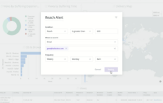
Insights to Your Inbox: Threshold-Based Alerting

Screen Shot 2020 09 17 at 8.25.22 AM 1024x645 1

With so much going on and so many tasks to manage, it can be hard to track the progress of your goals. Not anymore. With Kollective IQ, you can easily set up and automate alerts to let you and your colleagues know when certain KPI thresholds have been reached.

  • Want to be alerted when you achieve an excellent Quality of Experience (QoE) score during a monthly CEO Town Hall meeting?
  • Need to know when you are saving 90% or more of bandwidth when releasing the latest Windows 10 update?
  • Want an update when your broadcast event has reached all 2,000 of your first-line healthcare employees?

Setting up alerts in Kollective IQ is easy and gets you the data you need, when you need it.

Easily Import Data from Kollective IQ into Power BI

As cloud-based applications become more popular throughout the enterprise, controlling SaaS sprawl has become a common conversation among IT teams – especially when it comes to reporting and data silos. At Kollective, we recognize how important it is for our technology to play nicely with business intelligence platforms like Microsoft’s Power BI and we’ve made it easier than ever to push data into third-party systems.

In less than five minutes, you can automate reporting from Kollective IQ into Power BI using Webhook or Amazon S3.

Trial Kollective IQ

Ready to see Kollective IQ in action? Signing up is easy. It only takes six clicks – and it’s FREE. Kollective IQ is included in every ECDN trial.

The post Kollective IQ: The Smartest ECDN Analytics Platform Just Got Smarter appeared first on Kollective Technology .
To view our Partner blog, click here

Distributed Devices: Reaching The Edge In The Age of IoT

analytics

The world of work is changing. From cloud computing systems to remote working opportunities, technological innovations are becoming an integral part of our professional lives.

As part of this changing culture, businesses are increasingly contending with how to incorporate the ‘Internet of Things’ (IoT) into the modern office environment. Wearable technology, smart gadgets and intelligent lighting systems are just a few examples of hardware that IT departments will soon add to their internal networks.

But just like any other machine on a company’s network, it’s vital that these IoT devices receive regular updates for maximum security and functionality.

This presents a complicated problem for IT managers to solve — with the IoT bringing new operating systems, new update schedules and thousands of new devices into the workplace.

Given so many of these devices will operate at the edge of the corporate network, how can IT departments connect their IoT devices at scale and ensure they stay up to date without putting a huge strain on existing IT systems and network infrastructure?

To understand these concerns, and explore the future direction of enterprise content delivery, we at Kollective are pleased to announce the launch of our latest research report: Distributed Devices: How Today‘s IT Leaders Are Taking Their Businesses To The Edge.

This report draws on research from 270+ IT decision makers across the US and UK, providing insights into what companies must examine when integrating the IoT into their systems and the role that Software-Defined Enterprise Content Delivery Networks (SD-ECDN) will play in the future of Enterprise IT and IoT update distribution.

The post Distributed Devices: Reaching The Edge In The Age of IoT appeared first on Kollective Technology .

To view our Partner blog, click here